March 7th, 2024 Update - Report Center
There will now be a toggle control on the Graph Tab in report center available for all. By selecting this toggle, users can view reports in the previous format.
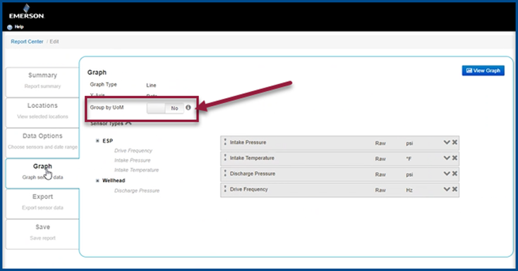
Toggle off = Old format.
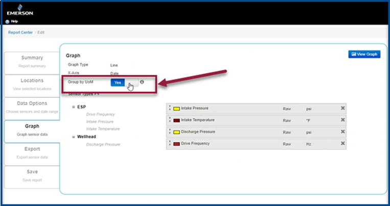
Toggle on = New format.
- When the toggle off has been selected.
a. Each sensor gets its own Y-axes.
b. Each axis gets its label with the associated UoM.
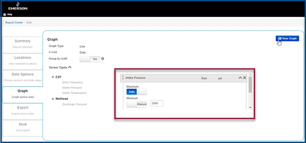
c. Minimum and maximum Y-axis values are entered by the user.
d. The old color palette is back for graphs by default.
e. The cap on 6 sensors per graph is back.
There is no [raw] qualifier in the legend for each sensor listed.
2. Even with the toggle off, some changes are still noticeable:
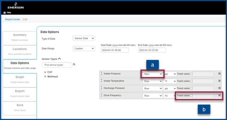
a. Users can now pick raw, Hourly and Daily QTRs for each sensor, however raw is the default for each sensor.
i. If a user accidentally picks Hourly or Daily QTRs and there are none for the selected sensor, no data will be displayed on the graph.
b. Users can also pick sensor names and/or location properties to be graphed, however by sticking to sensor types users will be able to build graphs the way they always did.
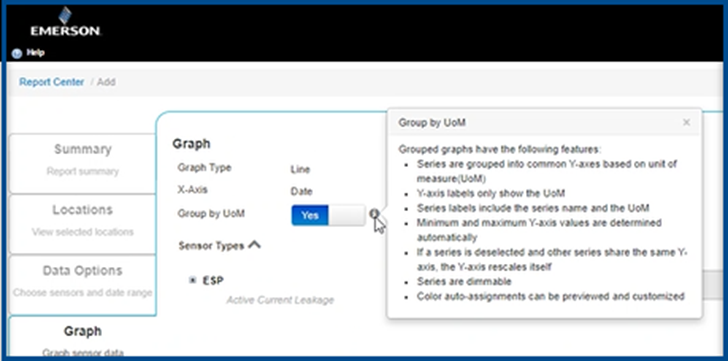
3. When toggle on is selected:
a. Series are grouped into common Y-axes based on the unit of measure (UoM)
b. Y-axis labels only show the UoM.
c. Series labels must include the series name and the UoM.
d. Minimum and maximum Y-axis values are determined automatically.
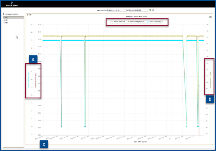
e. If a series is deselected and the other series share the same Y-axis, the Y-axis rescales itself.
f. Series are dimmable.
g. Color auto-assignments can be previewed and customized.
Customer support service by UserEcho
